

Crafting brands that thrive with authenticity and purpose
conversation is the foundation for creating your brand
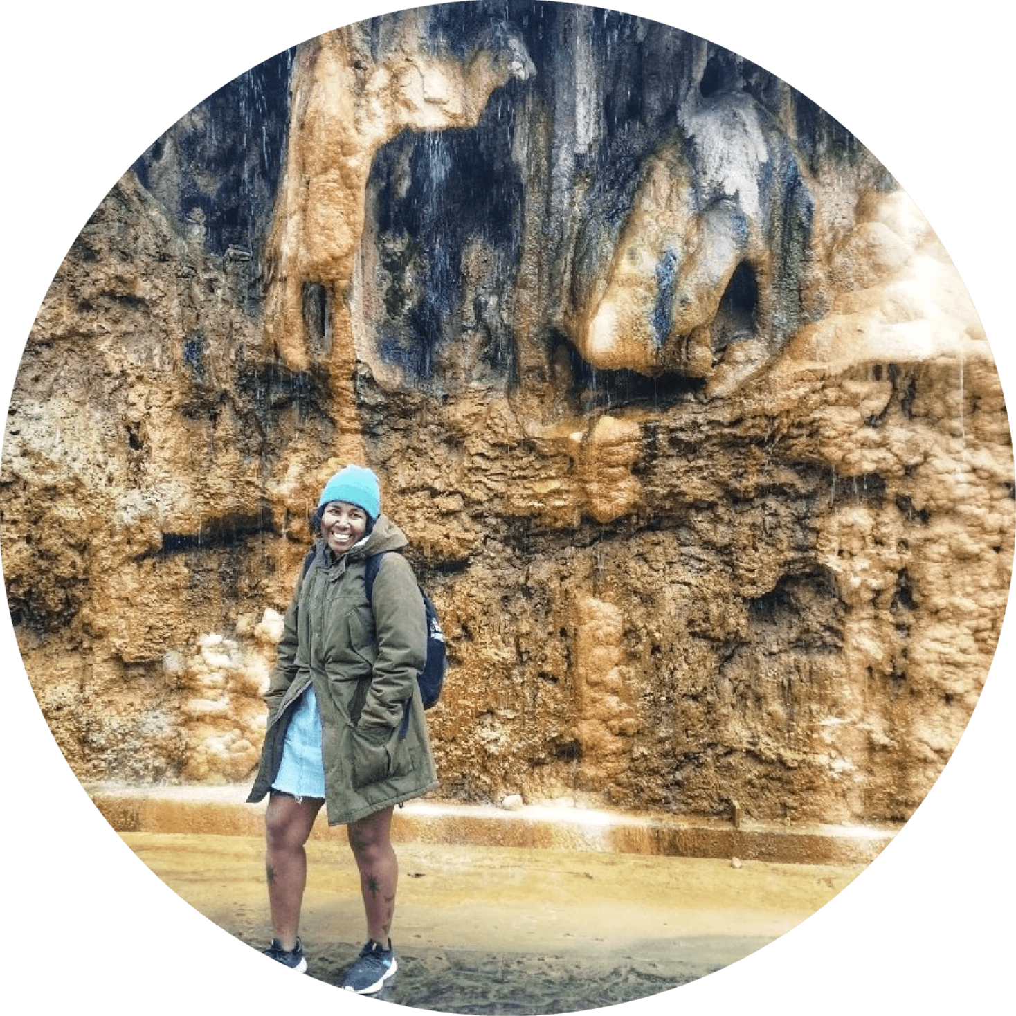
Meet Barbra
Visual artist, illustrator, and brand specialist with over seven years of experience in art direction and crafting vibrant visual identities.

A Thoughtful Journey to Your Brand’s Identity
MY APPROACH
Every brand begins with a story. I immerse myself in your vision, values, and the emotions you want your audience to experience.
Bringing Brands to Life Through Design
portfolio
Every design is a collaboration, built to express a brand’s personality and make a meaningful impact. Take a closer look at the work and see how ideas become identities.
Get in Touch and Start Your Journey
Let’s Bring Your Vision to Life
Whether you’re ready to build something extraordinary or just curious about how we can work together, don’t hesitate to reach out. Together, we’ll craft a visual identity that resonates and inspires.
Your Next Chapter Starts Here
Let’s Shape Your Brand’s Story
From ideas to impact, everything begins with a connection. Reach out to explore how your brand can truly stand out.
MY APPROACH
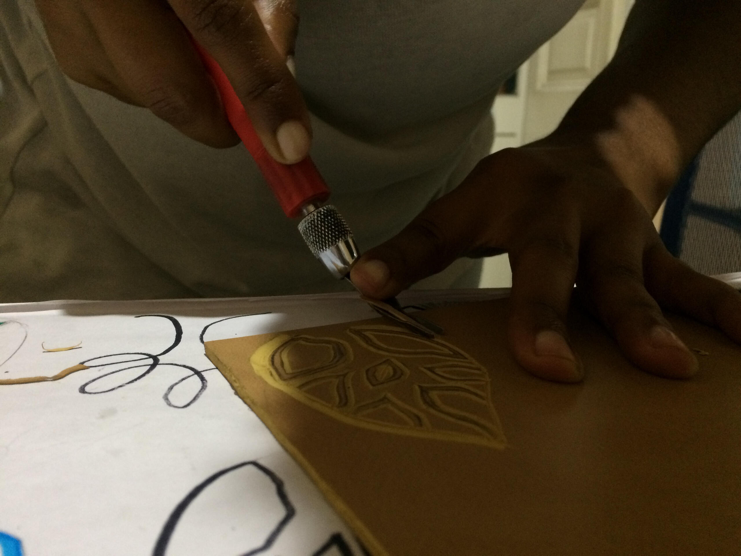
Creating a visual identity is about more than designing a logo—it's about crafting a sensory experience that tells your brand's story and resonates deeply with people. My process blends analog techniques, natural inspiration, and a focus on emotion to build a brand that feels alive and authentic.
The visual essence of a brand—logos, colors, typography, and imagery that shape its look and feel.
VISUAL IDENTITY
SERVICES
Logo Design: Crafting a symbol that represents your brand’s essence.
Color Palette Creation: Choosing colors that evoke the right emotions and communicate your message.
Typography Selection: Picking fonts that add character and align with the brand personality.
Imagery and Graphic Elements: Creating icons, illustrations, and visuals. that enhance the brand look.
BENEFITS
Recognition: A well-crafted visual identity allows your brand to be recognizable even at a glance.
Consistency: Creates a unified look across all brand touchpoints, establishing a cohesive appearance.
Memorability: The more visually consistent a brand is, the easier it is for the audience to remember it.
The heart of a brand—its mission, values, personality, and the emotional bond with its audience.
BRANDING
SERVICES
Brand Strategy: Establishing mission, vision, and values that guide the brand’s journey.
Brand Voice and Messaging: Defining a tone that speaks to the audience authentically.
Positioning and Differentiation: Strategizing to make the brand unique and relevant.
Brand Storytelling: Weaving a narrative that resonates and builds connections with the audience.
BENEFITS
Emotional Connection: Branding builds an emotional bond with your audience, leading to loyalty and trust.
Differentiation: Branding helps a company stand out from competitors by defining a unique position and voice.
Longevity: While trends come and go, a strong brand identity evolves, sustaining long-term relationships with customers.
Let’s take your brand on a creative journey—step by step—transforming ideas into a cohesive and captivating identity.
WHAT'S NEXT?
KICK OFF: We’ll start with a friendly meeting to align on goals, timelines, and expectations. Think of this as planting the first seeds of your brand!
BRIEF: I’ll gather all the details about your brand’s personality, audience, and objectives. This is the foundation—the rich soil where our ideas will take root.
VISUAL CONCEPTS: Based on the brief, I’ll present initial visual ideas to capture the essence of your brand. This is the “sprouting” phase, where we explore the creative direction together.
PROPOSAL: Once we agree on the visual concept, I’ll refine it into a comprehensive proposal, ensuring every detail aligns with your vision. This is when our sprout begins to bloom!
DELIVERABLES: Finally, I’ll deliver all the completed assets, ready for use across your brand ecosystem. From logos to color palettes and beyond, your brand will be equipped to thrive like a flourishing forest.
Are You Ready to Begin?
Every great brand starts with an idea. Let’s work together to create something that speaks to your audience and stands the test of time.

Roots
This package provides the foundational elements every new visual identity needs to grow. It includes a logo, typography, colour palette, graphic assets, photography guidance, and a brand guidelines book to ensure consistency. Additional elements can be added to suit your needs.
from $2,500
Social media templates
Logo animation
Landing Page
Packaging
Full Stationery...
... and more. Get a custom quotation for your project.

CANOPY
This package cultivates your brand’s identity with a deeper, strategic approach. It includes a branding strategy, logo, typography, color palette, graphic assets, photography guidance, social media templates, stationery and a comprehensive brand guidelines book. Optional add-ons are available to further expand your brand’s reach.
from $4,300
Logo animation
Landing Page
Packaging
Full Stationery
Promotional templates...
... and more. Get a custom quotation for your project.
Sent!
Thank You for Reaching Out
Your message has been received, and I’m thrilled to explore the possibilities with you. I’ll get back to you as soon as possible—exciting things are ahead! In the meantime, feel free to explore more of my work or follow along on my creative journey.
portfolio
Branding and design projects shaped by color, narrative, and intention.
Click on the images to explore each project.


Case study: El Árbol
El Árbol is a company that wants to help people transform into their best selves, they offer all kinds of therapy and natural treatments to create a healthy energised lifestyle giving people tools to grow.
It was important that the brand presented itself like a world of possibilities and it's transformative core showcasing the strong roots of their practices and how it makes people grow into their better selves.


It all starts with the Tree, the leaves and the best way possible to show transformation a space for their practices/categories. It all needed to look and feel natural, that's why the engraving medium was used, trying to keep it as close as possible to woodcut technique.


"Everything we do is designed to awaken the energy within you, inspiring self-reflection and personal transformation. Through an integrated approach that blends holistic therapies with functional medicine, we activate the health and awareness inherent in you. Our center and community provide a comprehensive wellness experience, rooted in harmony with nature and a commitment to your holistic well-being."


Case study: Yuju Co-living
From the start Yuju Co-loving shows playfulness, a space that people can make their own for the time they need it and having various locations inside of the peruvian territory, they could make the life of today's nomads easier through a shared space with all commodities.
The concept had to show a versatile place that could be able to change and adapt, constructed so the people could feel even though they might be different they're building a community from the inside out. With Brutalism as the inspiration, adding a big spoonful of fun, Yuju was born.


The colour palette should reflect peace a a contemporary technological flare adding of course, a fun Yuju's personality with some custom textures that could still reflect the architectonic style we were inspired by.


Yuju is a brand that likes to communicate, so it has various graphic assets that portray that such as emoticons and speech bubbles. The versatile tagline "es lo mío" It's my thing/mine makes the customer feel a sense of property and ownership too, opening up the opportunity of community.


Case study: Kaya Kené
Kaya Kené's heart is the ancestral wisdom and connection, Kené is the art of the Shipibo-Konibo tribe from the Peruvian Amazon Rainforest and Kaya means Goddess. All this inspired a new identity that could show culture and mysticism behind the ancestry of Kaya Kené's vision.


The colour palette should be genderless, and the typography is a contrast between classic and modern and the main graphic asset are the light threads.


A set of plant illustrations was created with the light thread so Kaya Kené could create from nature too. This brand communication is mostly in digital environments, social media templates were designed for that purpose.


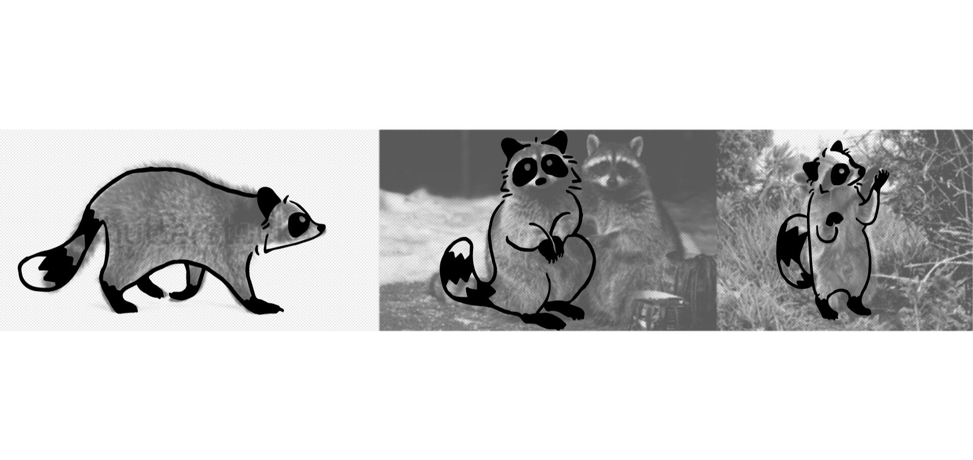
Case study: Benjumanji's Wild Harvest
Benjumanji is mora than a brand but de idea of a community inspired by nature and how we as humans sometimes forget we are part of it. The creator of Benjumanji already felt represented by a raccoon, which is the perfect animal that can translate this connection between nature and urban environments. So we started there, with the humble raccoon.


An illustrated brand with multiple graphic assets, Benjumanji's colour palette also reflects the seasonal offerings they have. Patterns, brushes and stamps were made so the whole brand hand-made, hand-harvested feeling will prevail in all the touchpoints of it's communication.


"The inspiration behind Benjumanji is to break that spell and show people what the natural world has to offer with a little trade. Balance"


Case study: Santiago de Surco's Municipality
Surco is a city rich in history, one that needed a simple and approachable identity—something that resonates with its residents, feels human and dynamic, and communicates effectively. Visually, it had to be practical, celebratory of its pride as Lima's green district, and both clear and informative. The story goes that, even before the arrival of the Spanish, Lima was an area surrounded by farmlands, and Surco was no exception. The Surco River Canal, built during pre-Inca times, irrigated the lands where vineyards thrived, producing the grapes used to craft some of the region's finest wines


This identity aims to reflect Surco's connection to nature, its pride as Lima's green district, and its agricultural heritage. Organic lines, fresh colors, and visual elements evoke the farmlands and the dynamism of a city that honors its roots while looking toward the future.


The Foundation of Great Design
Connection is key
I bring a nature-inspired perspective to my work, blending digital and traditional techniques to create designs that feel organic, authentic, and deeply resonant. I’ve collaborated with publishers, agencies, and independent authors; infusing life, personality, and purpose into every project. My focus is on crafting cohesive, meaningful visuals that not only captivate but also connect with each client’s audience.
I approach branding with the goal of creating work that feels timeless, grounded, and full of purpose.
